
Introduction
The Project
Western Union, a global financial company, helps people send money online and through retail locations worldwide.
I revised their user interface to make sending money a much more intuitive process.
Objectives
- Optimize services & increase user engagement & conversions
- Synthesize research finding into design insights for the app redesign
- Increase memorability of WU App
- Design User Flow
- Create One-Stop App, covers all aspects of user feedbacks and clearly supports what services users would like to see and access when using the app for remittance.
- 24/7 customer support for peace of mind to end users
The Challenge
Thirty-six percent of customers dropped off in the middle of a transaction because they didn’t know how to proceed. Even when completed, 25% of money transfers ended up on hold or declined because of incomplete or incorrect information.
Content sounded like a bad translation in other languages, making the brand feel disconnected from their local customers.
9:41


Current design model
Pros:
Strong branding.
Minimalist style.
No advertising.
Cons:
No animation.
No indication of progress.
Current design model

Login screen has a unappealing display, giving the app an rushed and cheap look.
A blank space at the bottom for ads is also present.
Buttons are present but cannot be accessed without first logging in.
Current design model

No significant change after logging in.
The login sign up buttons changed to “Send money”.
Colors and Typography
FFDD00
222933
3698F3
FFFFFF
Comparison
Modified design screens
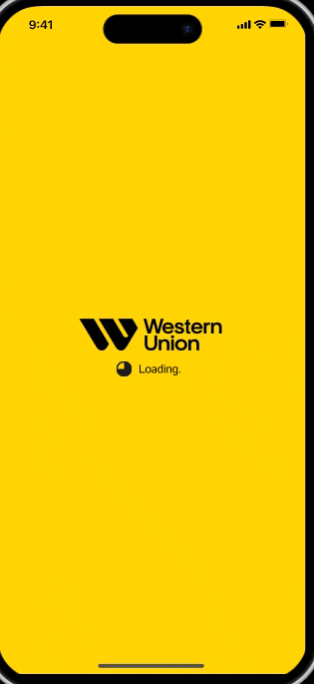
9:41

Added an animated loading circle to help the user know how far along the loading process is. This helps the user know that the app hasn’t frozen.
Modified design screens

9:41
Login
Sign up
Menu
Send money from your
account directly to theirs.
9:41
Login
Sign up
Menu
Send money from your
account directly to theirs.
Cleaned up the log in area by using one photo across the screen.
Placed the login and sign up buttons lower so it’s easier to reach with thumbs.
Removed Ad space.
Modified design screens
Send money
Menu

9:41

Added more buttons to the interface for quicker and easier access
Kept the visual of a family photo.
Added a navigation bar for quick transitons to other important pages
Updated the “Send money” button so that
it’s contrast let it pop more.
Current design model
Current design model
Modified design screens
9:41
Login
Sign up
Menu
Send money from your
account directly to theirs.
9:41
Login
Sign up
Menu
Send money from your
account directly to theirs.
Login screen has a unappealing display, giving the app an rushed and cheap look.
A blank space at the bottom for ads is also present.
Buttons are present but cannot be accessed without first logging in.
Cleaned up the log in area by using one photo across the screen.
Placed the login and sign up buttons lower so it’s easier to reach with thumbs.
Removed Ad space.